
Having a WordPress website theme that is not responsive in 2020 is like living in a mansion without electricity. As technology evolves and smart devices improve, Businesses around the world are noticing a sudden surge in users accessing websites on mobile devices.
If your website theme is not mobile responsive then you may be missing on millions of visitors and your business ends up taking a hit in revenue. So, to gain full advantage of the rising mobile visitors you need to make your website’s theme responsive.
Although if you want to add responsive functionalities to your current non-responsive WordPress Theme you would need to know coding. If you are unaware of web development it would seem a herculean task.
You anyways also have an option to hire an expert developer who can get it done at the quickest and charge a bit for the work done. But if time is no constraint and you want to make the design changes by your self then stay tuned, later in this article you will find what exactly needs to be developed/improved in order to get the best possible responsive theme.
Steps to Make Any WordPress Theme Responsive
- Make use of a fluid site grid with proportionate instead of fixed measures
- Make use of fixing images so as to scale them according to various screen sizes
- Make design changes to ensure easy usage for non-desktop devices
- Use CSS media queries to specify breakpoints for design changes
Keep in mind while the principles they stay the same for every WordPress website your site may require extra work considering the coding methods used by the theme developer.
Also, we would need a tool to check the site’s HTML and CSS Structure. You can use Firebug for that. We would also need a text editor to edit PHP and HTML files, Notepad++ would be our choice
Step 1: Add Default Zoom Code
In the first step, you need to tell the browser to render pages based on device-width. So for that, you need to add the following code to the header.php file in the theme folder. Add the code between the <head> and</head> tags.
<meta name="viewport" content="width=device-width, initial-scale=1" />
Step 2: Add Fluid Element Widths and Heights
Here is where the use of the Firebug tool kicks in. Firebug helps to display the HTML structure of your website inside the browser.
WordPress themes have the following elements:
- Body
- Wrapper
- Header
- Menu
- Main Content
- Sidebar
- Footer
Now, we need to find fixed-width definitions and replace them with a fluid one. For, example if you find something like:
#wrapper{

width: 900px

}
You need to replace it with something like
#wrapper{

max-width: 900px;

width: 100%

}
Implementing the above changes will tell the elements to take the space it needs and limits the width to a maximum of 900 pixels. Meaning, the page will look the same as it was before on screens larger than 900 pixels but this time take up the entire width on devices smaller than that.
Step 3: Resize Images
To make the images scale according to the screen size you need to add the below code to the style.css file of your WordPress Theme
img {

height: auto;

max-width: 100%;

}
This means you have declared that the images should be displayed in their original size until their screens put a limit on it.
Step 4: Implement Breakpoints
Now you need to implement design specific breakpoints starting with smaller screens and they move up to the larger ones.
So, to start with we need to make elements appear underneath one another if previously they were designed to appear side by side. So, the code will look something like this:
@media only screen and (max-width: 500px) {

.content {

float: none;

display: block;

width: 100%;

}

.sidebar {

float: none;

display: block;

width: 100%;

}

}
The above code will make the content expand across the entire screen Add the code at the end of your stylesheet and will be easy to read.
Step 5: Create a Mobile Menu
Creating a Responsive Mobile Menu is a tough job. You need to code a lot of things so the best would be to installing a WordPress plugin that can do the job for free.
Currently, the best Mobile Responsive Menu plugin in the market is Responsive Menu from ExpressTech.
Step 6: Adaptive Fonts
We need to adjust the font size according to the screen it is being viewed on.
Header text often doesn’t go quite well on smaller screens. We can control the font size using the following CSS inside media queries:
@media only screen and (max-width: 450px) {

.site-title, h1 {

font-size: 22px;

}

}
Final Thoughts
The above were some of the tweaks that you can do to your non-responsive website to make it look responsive and user friendly.
In order to get things right in the first place will be to install a Premium WordPress Theme. The theme that we recommend is the Oshine Creative WordPress Theme.
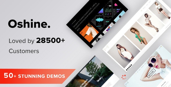
Oshine is a Creative Multipurpose WordPress Theme that is highly responsive and easy to install. It also comes bundled with a Powerful Page Builder that helps you build custom pages for your site that are unique and blazingly fast.
Oshine Theme is truly multi-purpose as it can be used to run Portfolio, Photography, Agency, Architecture, Business, Freelancer, Shop, and more websites.
Oshine has 50+ Demo Themes that are modern and professional which you can checkout and install depending on what suits best to your niche. You also get Colorhub and Typehub support for better color and typography control.
Oshine comes with 24×7 Customer Support which is considered the best and is considered one of the selling points. Oshine has GDPR is GDPR Complaint and Supports Multilingual Sites.
Do check out one of its demos and see yourself. Hope you find this article interesting